
By implementing web-font, your website visitors can perceive the text in desired typeface even when one is not installed on their device (as system-fonts are).1
In contrast to system-fonts, web-fonts can often emphasise uniqueness and originality. They are one of the instruments used to make your brand more outstanding.
The more custom and rarely-used the typeface is, the more the above phenomena are felt by the website visitors, mostly subconsciously. But...
Besides the advantages they offer, web-fonts are not appropriate at any cost. They should be implemented with caution in order to avoid some commonly overlooked troubles. The following aspects should be considered:
A rarely used type has a good chance being unusual to the readers, as readers are not quite used to unusual forms. The headlines might be appropriate and even interesting looking in such typeface, but the main text requires good legibility and clarity.

Make sure readability is good enough, otherwise the written content will be harder to absorb by your website visitors. The appropriate balance between uniqueness and usability can be beneficial.
In general, our website visitors’ displays still have pretty low pixel density, mostly on computers.2 Because of low-rendering accuracy, the (web) fonts could look less clear there, especially the ones from the Serif family or in small size.

What to do? Verify how the desired web-font is rendered on such displays. Note also that some system-fonts are customly pre-adjusted so they can render the content more effectively.
Some text-renderings can harm readability of particular (web) fonts. And sometimes they simply look too “pixelated” on curves. Here are couple of examples:

Figure 1: A text rendered in Mozilla Firefox web browser with truncated symbols (top) and Google Chrome (bottom), both under Microsoft Windows OS.
Figure 2: Top – a text rendered in Firefox (Windows OS), where the appearance of letters a, c, e, o, and s is truncated. Below, the text is rendered correctly in Firefox under Mac OS.
Figure 3: The curves appears to be pixelated in Firefox for Windows (top), while in Chrome for Windows, they are rendered more smoothly (bottom).
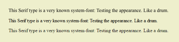
Figure 4: Firefox rendering under Mac OS – thicker (top) and Windows – sharper and more pixelated (middle). Some letters appear to be a bit truncated in Chrome for Windows (bottom).
Make sure how your (web) typography responds at various text-rendering.
1 The list of default system-fonts on Windows and Mac OS can be found at
the following addresses:
https://
https://
2 Hi-quality paper publications can have a density of dots up to 2400 DPI, while screens have up to ≈ 282 PPI. Yet most screens have around 100 PPI. Some users claim that 220 PPI is very good pixel density when looking from a distance of 40 cm. All data is from 2014.
To receive a full consultation and an in-depth inspection of your website, application, or publication, contact Percaption at info@percaption.com