
A case from www.apple.com: Although some country flags have stripes of equal width or height, there are some flags on that website that appear to have a non-equal ratio, which reduces the recognition. Here is one example, the flag of France:

Figure 1: Left – a proposition in “flat” style with all stripes in equal width. Right – flag from the website with the white stripe wider than blue and red.
Besides altering the stripes ratio, having some flags in non-glass style would also help in easier recognition. For example the flags of Côte d'Ivoire, Guinée, Mali, Nigeria, Deutschland, Ireland, Italia, Luxembourg, Malta, Nederland, România and Perú:
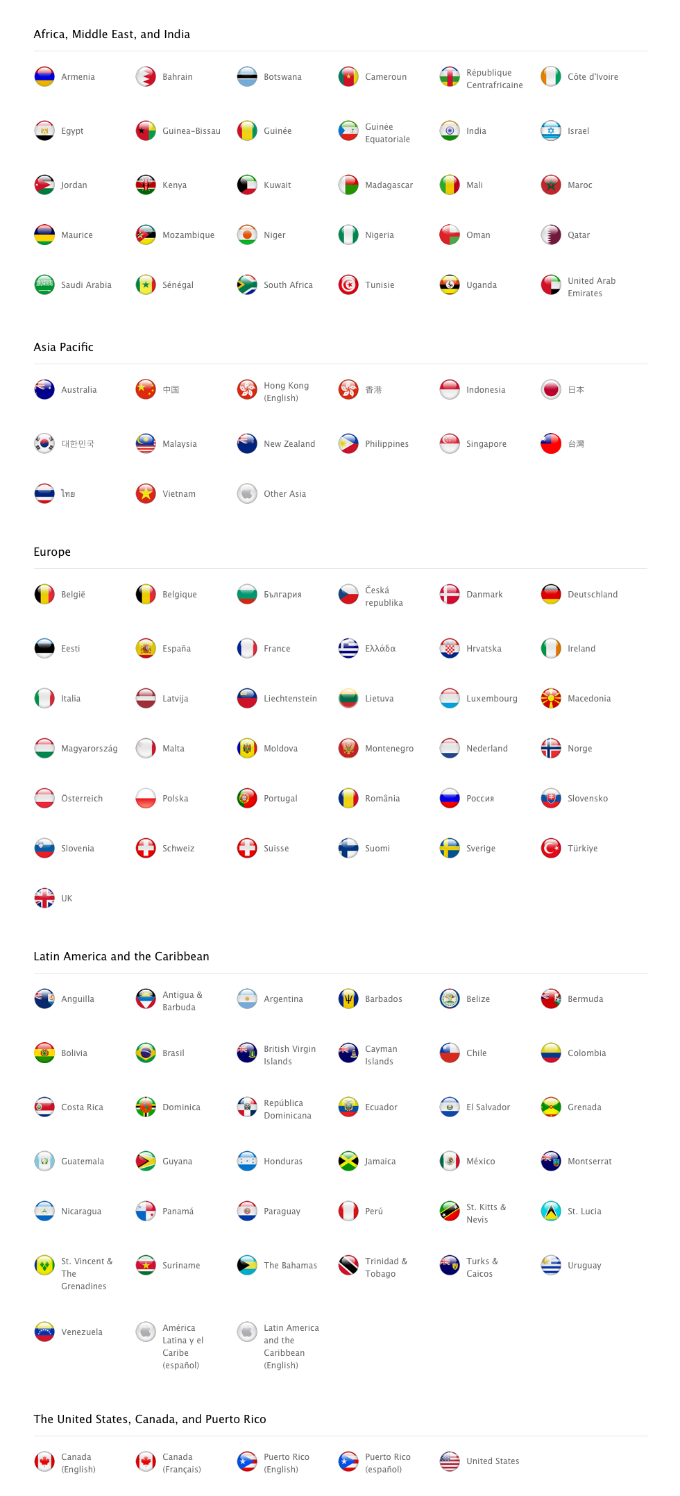
Figure 2: Flags on apple.com
A case from www.corel.com: In two close categories, an unequal font rendering appears to visitors with non-Windows font rendering. If the website text, rather than image text, were to be designed in the left category, an equal font rendering would appear to all visitors (not only to those with Windows OS):

Figure 3: Left category is an image that contains text. The right one is a website text rendered in Safari (Mac OS).

Figure 4: This is how text could look in the “Chat now” category. It’s the same as the right one (phone).
* Update: The Apple's flags page is now
altered 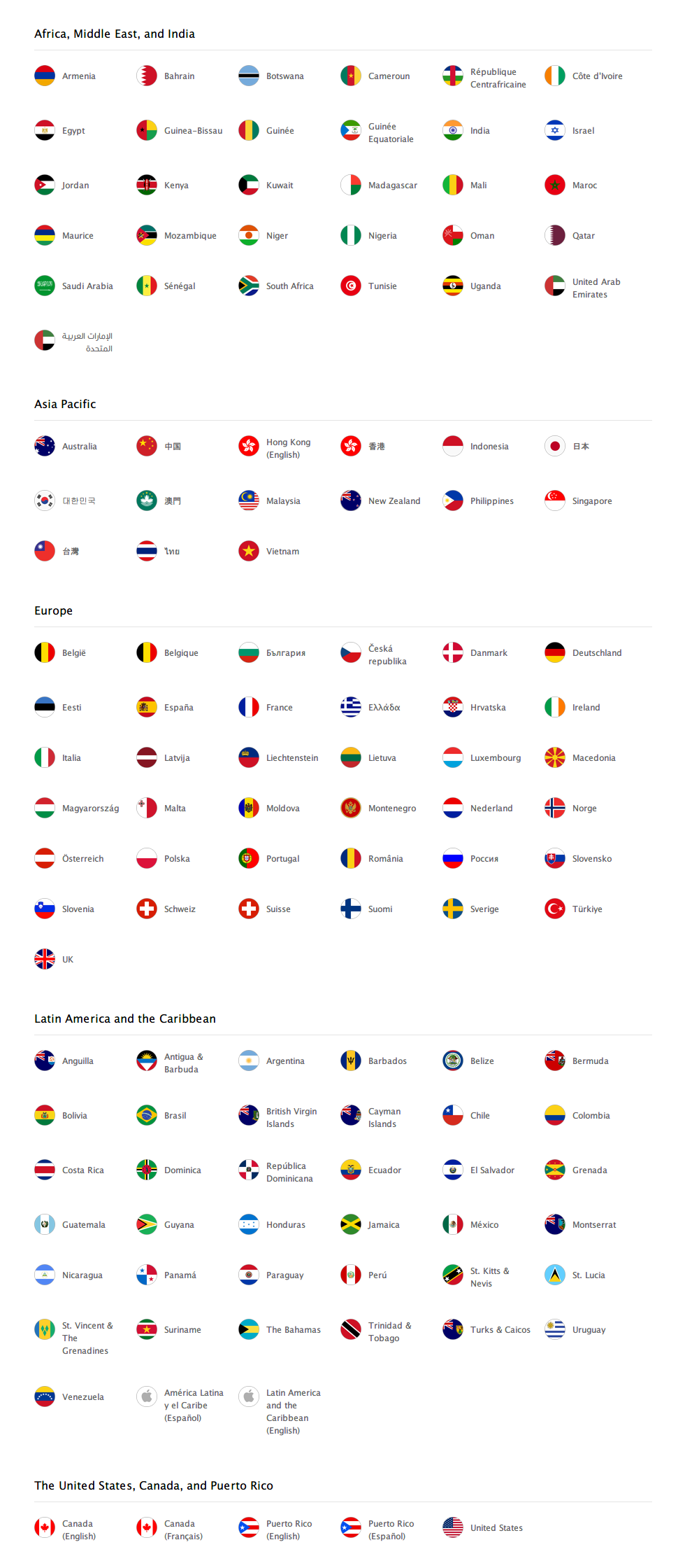 ;
the ratio is fixed, plus the “glass” style has been changed into a “flat”
style, which makes all the flags easier to recognise now. Congratulations
for putting this advice into action.
;
the ratio is fixed, plus the “glass” style has been changed into a “flat”
style, which makes all the flags easier to recognise now. Congratulations
for putting this advice into action.
To receive a full consultation and an in-depth inspection of your website, application, or publication, contact Percaption at info@percaption.com