The majority of electronic devices/
The more complexity there is, the
more attention and energy is required from the users. But sometimes
complexity can be driven out.
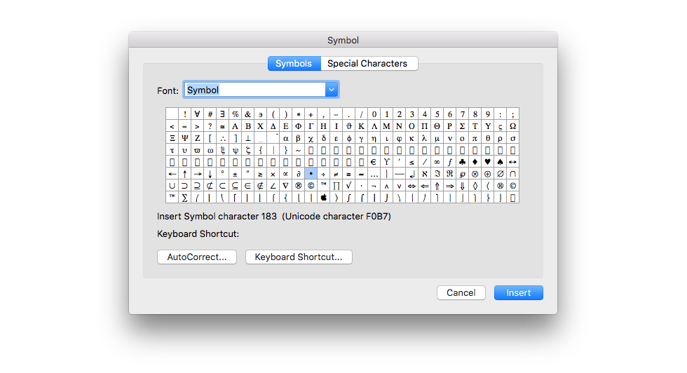
Figure 1: Symbols dialogue box in Microsoft Word.
When users access the Symbol dialogue box, they are looking
for a symbol or a special character to insert into the text. Currently, visually recognising a symbol among hundreds of
them is the only way to find the required symbol, even if users know the
symbol’s name. (Once inserted, the symbol goes into the “Last used” queue.)
Although there are subsets that make smaller groups of
symbols, it would be much easier to have a search field in which users could
simply type the symbol’s name and instantly find what they are looking for. Also, users are sometimes not confident in which subset
their wanted symbol belongs.
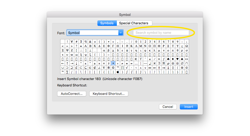
Figure 2: This is how the search field could be added at the top right, in order to make searching for a symbol by name a lot easier.
 For
example, let’s say the user is looking for a “numero” symbol in
Word’s Symbol dialog box. Instead of manually scrolling through hundreds of symbols
of varying shapes, the user could simply type into the search field “numero,”
“No,” “N,” or “number” and instantly reach that symbol.
For
example, let’s say the user is looking for a “numero” symbol in
Word’s Symbol dialog box. Instead of manually scrolling through hundreds of symbols
of varying shapes, the user could simply type into the search field “numero,”
“No,” “N,” or “number” and instantly reach that symbol.
That kind of process wastefully consumes users’ focus and energy. Users are focused on the content (writing) and in the moment when they want to insert a specific symbol, instead of quickly inserting, their focus goes from the content to manually searching and recognizing the wanted symbol.
Additional Advices: Name variations and associations are highly recommended for situations when users can’t remember the exact string to enter into the search field. For example, writing “numero,” “No,” “N,” or “number” finds the “numero” symbol. Also, some symbols look alike, making them harder to recognize. A magnifying tool or increasing the size of all symbols is recommended.
One of the fundamental methods to create easier and better experience in the digital and material environment is making a number of steps in achieving some goal as few as possible. By doing so, a number of neural processes in our visitors’ brain decrease and they spend less cognitive load, which in overall makes them more comfortable in our (digital) environment.
A case from www.volkswagen.ch: A user is interested in
Golf R version of VW’s most known car model. One selects
Modelle (step No. 1), Der neue Golf (No. 2), Der Golf R
(No. 3), and starts to watch the selected page. As one has interest in
configuring this car, the next step (No. 4) is
selecting “Jetzt konfigurieren” CTA button.1 But instead of continuing
configuring the desired car version, the user gets repetitive steps No. 2, 3
and No. 4 once again, which were already done before. Besides the confusion
in user’s mind “What happened now, where is the configurator?” user once
again has to search among all VW models and select Der neue Golf
(step No. 5), then Golf R (No. 6) and after that Konfiguration
starten (No. 7).
The entire process has three of seven steps causing excessive ballast in
users’ cognitive load with repetitive work and confusion – for no good
reason. Making a direct link in “Jetzt konfigurieren” CTA button to Golf
R configuration page would solve this unneeded complexity and reduce the number of steps from
seven to four.
Figure 3: User wants to
configure the Golf R version on Swiss VW website, getting repetitive
selections and seven instead of four steps for no reason. ![]()
A case from Apple website: A user from Slovenia wants to
get the Support page in the local Slovenian language. One types apple.si
(local domain name) but lands on apple.com (United States website),
resulting the "Support" page in the English language instead of the desired
local one.
User types again apple.si but the scenario repeats. After that,
the user decides to look where on the page one can change the country. That
can be done at the very bottom of the page and after that one has to find
the desired country among many of them, plus clicking "Support" once again.
In such scenario, users have to make at least two actions and quite
some thinking for no reason, before they finally get to the Support page in
the local language. All that unneeded effort could be avoided with simple
domain redirection from apple.si to apple.com/si as many other countries
have, for ex. www.apple.ch automatically redirects users to apple.com/ch.
Figure 4: A user wants to get
the support in native language. Instead of automatic redirection, the user
has to make at least two extra actions and quite some of thinking. ![]()
In order to create a user-friendly environment, complexity should be neutralised, or at least simplified. Actions should be easily performed to reduce users’ wasted energy.
1 CTA (call-to-action) buttons are important website elements inviting users to do some action.
To receive a full consultation and an in-depth inspection of your website, application, or publication, contact Percaption at info@percaption.com