
Although some people don’t notice the typographic details on a conscious level, they do perceive good typography subconsciously. One of the typographic elements that should be adjusted meaningfully is the space between characters.

Figure 1: Capital letters spaced at 7.2% of the type size.
When we add extra space between capital letters, the typography is usually perceived as more elegant. Shorter captions, headings, and titles as well as long digit strings are suitable for such adjustment.

Figure 2: Long digit strings with default spacing on the left and expanded spacing on the right.
Increasing the default space between lowercase characters is, in most cases, not recommended because it hinders legibility. As a matter of fact, quite the opposite should be done; narrowing the space can add to perception that the typographical structure is more stable (see “Charles” in Figure 3).
Instead of extra spacing acronyms, web, and e-mail addresses as the content where letters function one by one, setting them in a monospaced typeface could be more beneficial. Example: www.percaption.com
Should that not be implemented, a moderate increasing of space could be set.

Figure 3: “Charles” and “Switzerland” appear to have extremely opposite letter-spacing.
A case from the Charles Vögele logo: Ironically, coming from the land of typography, a legible “Switzerland” in Gill Sans typeface is enormously letter-spaced. The reason for such unusual spacing was probably the designer’s intention to fill the logo’s width.
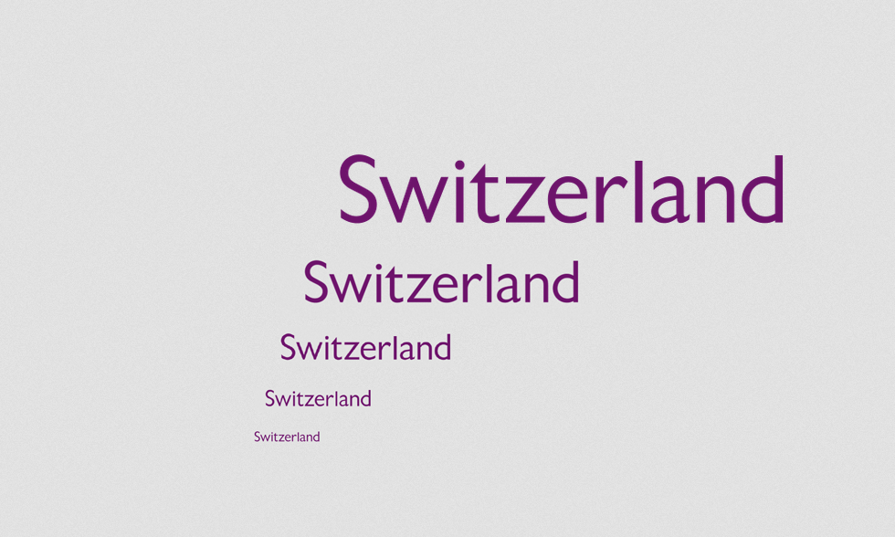
Figure 4: Appearance testing with our
space readjustment between
the same letters ![]() .
.
A case from Audi brand: This is another needless
increasing of letter- (typographic in this case) should apply to all aspects of a
brand’s visual perception.
(typographic in this case) should apply to all aspects of a
brand’s visual perception.
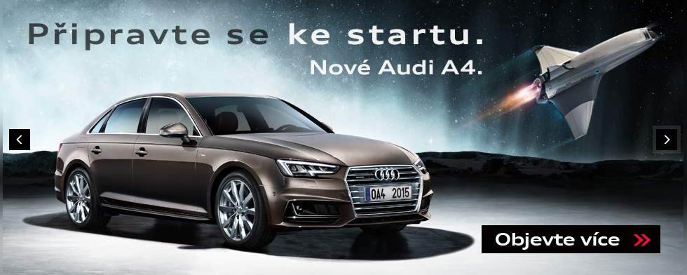
Figure 5: “Pripravte se ke startu” was unprofessionally altered most probably to fill the emptiness in the top-left banner area.
A case from Google Maps: Capital letters would fit better for "Sweden" and "Finland" captions not only because of increased letter-spacing but also because people are used to maps having letter-spaced capital text in country names for ages.
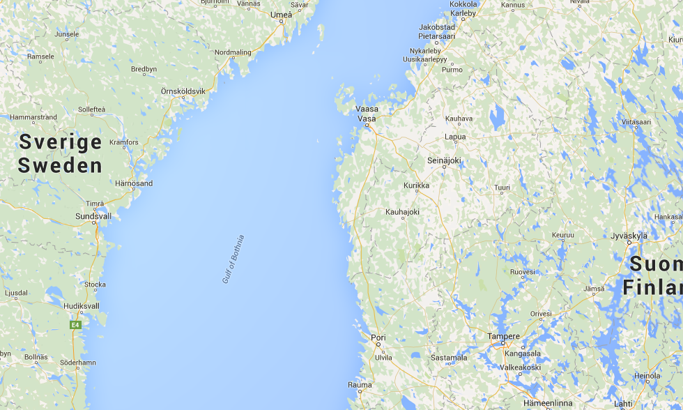
Figure 6: The letter-spacing is not that huge, yet it is unnecessary and unusual.

The extra letter-space could be set on condensed lowercases (mostly bolder and smaller Sans-Serifs) in order to make the text more legible. Capital letters could include negative letter-spacing when the caption is big.