There is a phenomenon in our nature called consistency. It’s a phenomenon people are striving to achieve in all areas of life. The more consistency there is, the easier people’s perception of their environment becomes. Here is one story about visual (in)consistency on the screen:
It’s been quite some time now since all major IT companies largely abandoned skeuomorphism, a design style that often creates an impression of 3D objects on the screen.
So it was with Apple, which used to have a glass, gel, and metal-like Aqua sub-style of skeuomorphism across their entire screen products and presentations. Then, they made a switch as well. Suddenly, new versions of computer and mobile operating systems and applications started looking much closer to what is called a flat style, or strictly 2D non-imitated appearance.
Figure 1: Left – Apple's Mac OS buttons in a skeuomorphic style used from 2001 to 2014. Right – buttons in the new flat style.
A case from www.apple.com: To gain consistency with Apple's OS and applications in users’ visual perception, their website went in the same flat-style direction but not entirely:
The flags page mostly remained in the older glass and gel-like Aqua style. Not only some countries’ flags appear less recognisable in comparison with flat-style ones but the flags’ appearance also causes inconsistency with other flat elements as well as with other flat-style pages under this domain.
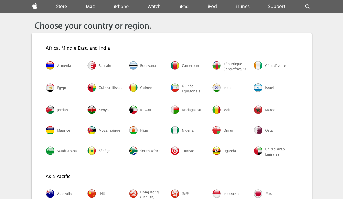
Figure 2: The navigation bar appears in the new flat style, while the flags are shown in the older glass-like skeuomorphic style, causing style inconsistency on the website.
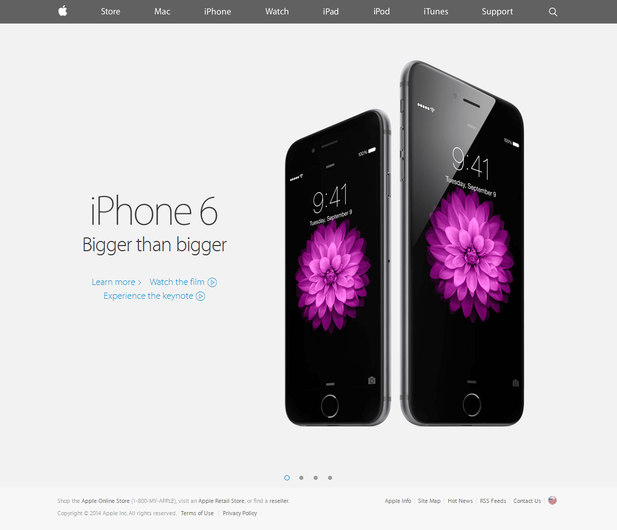
Figure 3: The navigation bar (including logo and search icon) and the slide-switching buttons (four circles below the photo) appear in the new flat style, while the rounded flag at the bottom right remained in the older glass-like style.
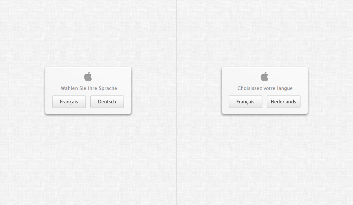
Figure 4: On apple.ch and apple.be primary pages, the language buttons and the dialogue box remained in the old style, while the other elements after this page are in the new style.
* Update: The old style on the flags page
is now completely
replaced 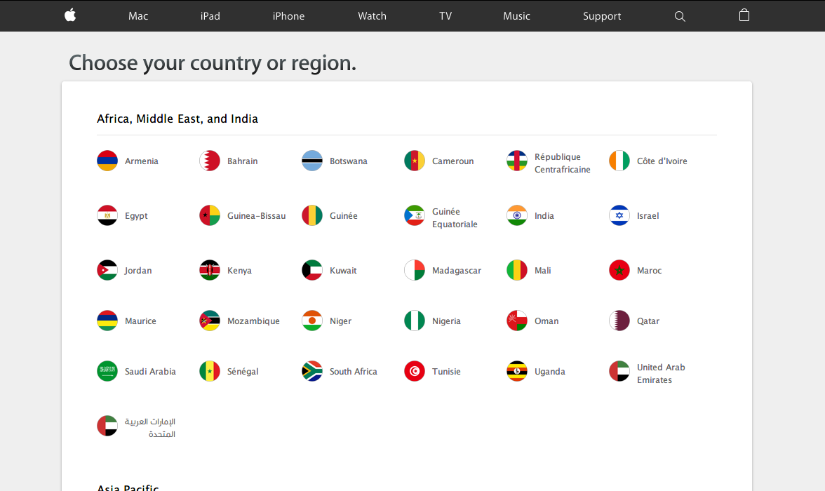 with the new one. Congratulations for putting this advice into action.
Consistency matters because keeps customer and visitor confusion away – consciously or subconsciously. Make sure visual as well as other levels of perception are consistent everywhere, including on your website, publications, manuals, store, office, etc.
To receive a full consultation and an in-depth inspection of your website, application, or publication, contact Percaption at info@percaption.com