The application elements that make no practical change should sometimes be removed (or otherwise hidden) from the screen because they needlessly occupy users’ attention. When there is no beneficial contribution, these elements cause excessive ballast in users’ cognitive load.
A case from www.uber.com: On the Cities webpage, there appears to be a completely unnecessary horizontal scrollbar at the bottom of a web browser. Although horizontally, the content is entirely shown to the visitors, the scrollbar appears as if there should be more content yet to be discovered by moving to the right.

Figure 1: Uber.com Cities webpage on Mac OS. Would moving the horizontal scrollbar show something more?

Figure 2: Same appearance on Windows OS with unneccesary horizontal scrollbar.
When visitors come to such a webpage, they see something unusual, something they have not seen on hundreds of other pages. Because of that, such an unusual element (e.g., a horizontal scrollbar) takes attention from visitors’ focus they devote to the content.
If visitors attempt to discover what’s hidden at the right side of their current view, they don’t see anything added, though they expected something more. That is a needless, unfulfilled expectation for them that doesn’t contribute to the perception that the website is flawless. If scrollbars don’t serve a purpose by showing something more, there should be no scrollbars at all.
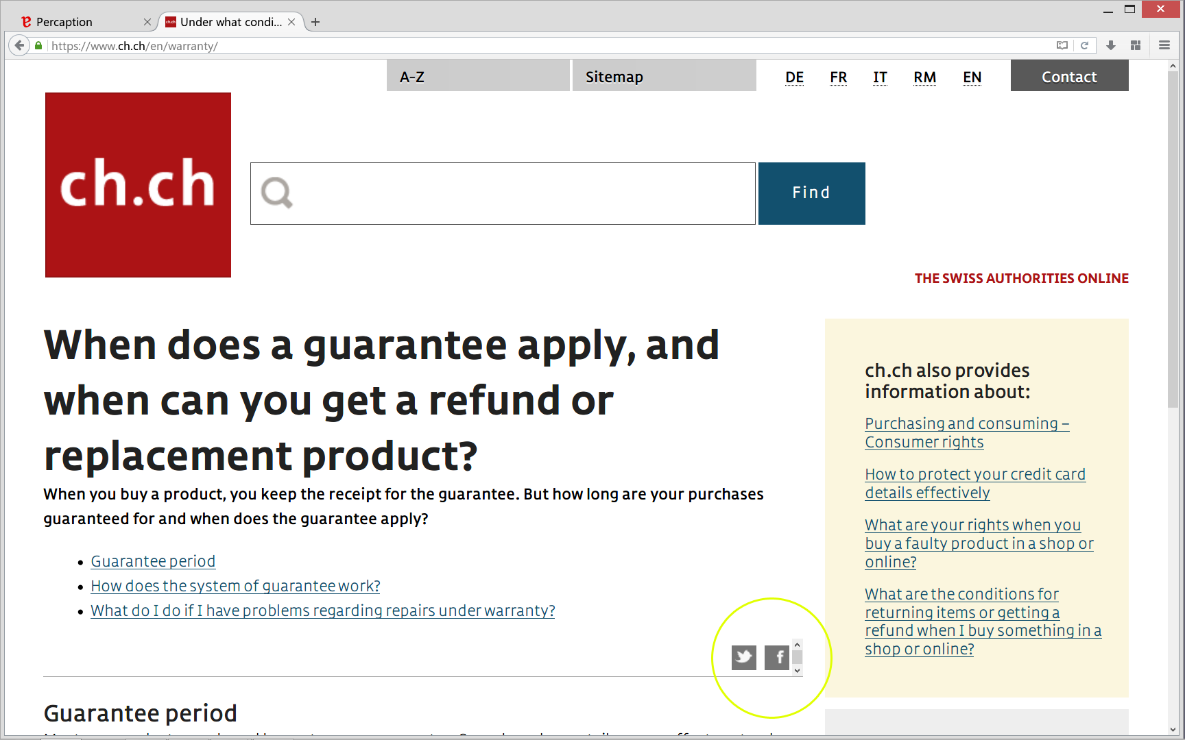
Figure 3: A second (small) vertical scrollbar appears after zooming in on the www.ch.ch website. Pressing up or down buttons makes no change for the user.
A case from www.penzionberg.sk: There is a language selection on two places of this website (top-right and bottom-left). Both selections offer no other language than Slovakian, which visitors already have displayed. From the visitors’ perspective, that is a needless expectation for them.
Also, on majority of user interfaces duplicating the same functionality (in this case language selection) is not recommended, as it needlessly cause excessive ballast in users’ cognitive load.
Figure 4: Trying to select another language on
penzionberg.sk but the only available language is the already displayed one. ![]()
* Update: The Uber website now has no more needless horizontal scrollbars. The language selections on penzionberg.sk are now completely removed. Congratulations to both for putting our advices into action.